
こんにちは、コンスキです。
今回は、タブレット用のメディアクエリ設定の最終調整に入っていきます。
GIMPで作ったレイアウトと現状の比較
細かい部分の修正をするときには、レイアウトの目標と現状を比較すると現状をどう修正すればいいのかわかりやすいと思います。
そこでGIMPを使って作ったタブレット用のレイアウトと現在制作中のポートフォリオサイトを横に並べて比較してみます。
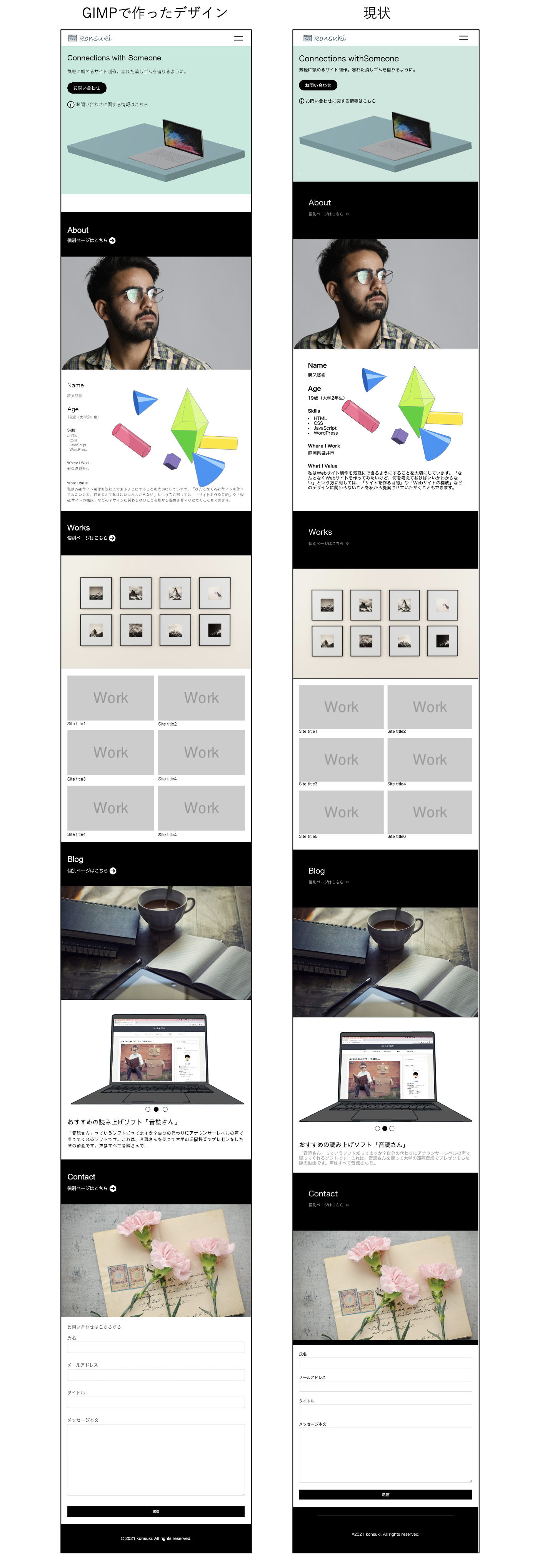
自分では、元々のレイアウトと見た目をほとんど同じにするつもりでメディアクエリの設定をしてきました。
しかし、こうやって並べてみると全然違うという印象を受けました。
もちろん、後から「この方がいいな」と思ってわざともとのレイアウトと違うようにした部分もあります。
意図していなかった違いについては、なるべくなくしていこうと思います。
修正予定の箇所
修正していく部分に目印をつけたのがこちらです↓
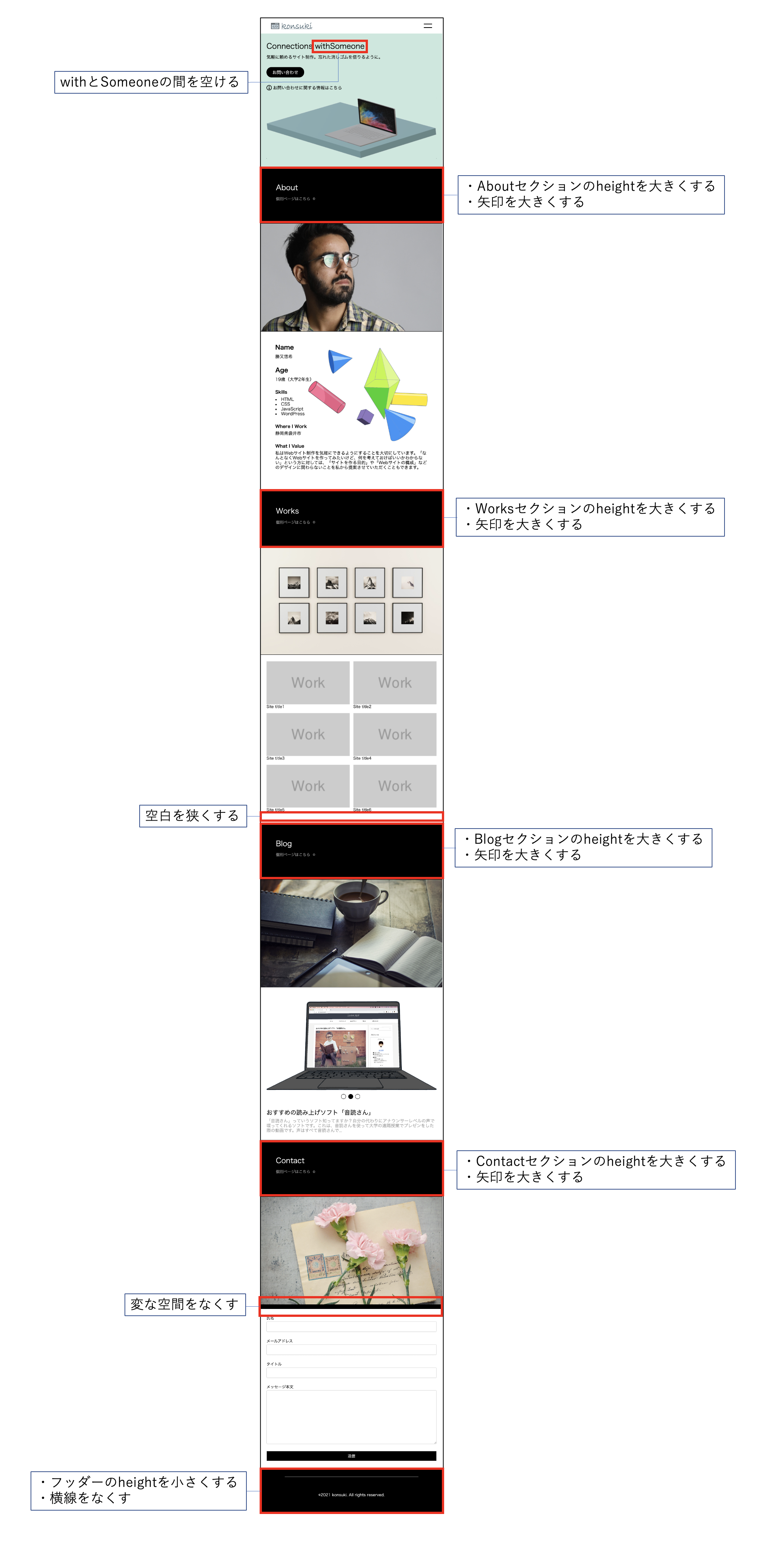
修正箇所によっては、タブレットのメディアクエリの設定だけでは修正が難しい場合もあると思います。
そのような時は、パソコンの見た目を決めるcssファイルに手を加えていきます。
それでも直せなかった場合は、phpファイルを変更して直接要素の順番を変えるようなこともあるかもしれません。
「style.css」と「front-page.php」の変更
それでは実際に変更を加えた部分を示します。
まずは「style.css」です。
変更を加えたり、新しくスタイルを追加した部分は強調されています。
img {
  display: block;
  max-width: 100%;
  height: auto;
}

/* ヘッダートップ */
#header_top {
  display: flex;
  justify-content: space-between;
  align-items: center;
  position: fixed;
  left: 0;
  top: 0;
  z-index: 10000;
  width: 100vw;
  height: 64px;
  padding: 0 43px 0;
  background-color: #ffffff;
}
#navigation_bar_container {
  height: 18px;
}
#navigation_bar {
  display: flex;
  margin: auto 0 auto;
}
.nav_item {
  height: 18px;
}
.nav_text {
  margin-right: 46px;
}
#nav_text_last {
  margin-right: 0;
}
/* ヘッダートップの高さ分だけファーストビューを下に下げる */
#first_view {
  margin-top: 64px;
}

/* ハンバーガーメニュー */
#hamburger_button {
	display: flex;
	flex-direction: column;
	justify-content: space-between;
	position: absolute;
	left: -34px;
	top: 18px;
	width: 34px;
	height: 18px;
}
.hamburger_line {
	z-index: 100;
	width: 100%;
	height: 3px;
	background-color: #000000;
}
#hamburger_menu {
	position: absolute;
	left: 0;
	top: -1000px;
	z-index: -1;
	width: 100vw;
	height: 100vh;
	padding: 50px 24px;
	background-color: #ffffff;
	transition: all 0.5s ease;
}
#hamburger_menu_list {
	display: flex;
	flex-direction: column;
	justify-content: space-between;
	height: 254px;
}
.hamburger_menu_list_item {
	display: flex;
	padding: 18px;
	background-color: #f5f8fa;
}
.hamburger_menu_icon {
	width: auto;
	height: 18px;
	margin-right: 5px;
}

/* ファーストビュー */
#first_view {
  display: flex;
  height: 37.5%;
  padding: 6vw 8.75vw;
  background-color: #C9e8de;
}
#fv_tagline_container {
  width: 40%;
}
#fv_tagline_main_container {
  height: auto;
  margin-bottom: 18px;
}
#fv_tagline {
  height: auto;
}
.fv_tagline_main {
  height: auto;
  font-size: 4vw;
}
#fv_tagline_sub_container {
  width: 100%;
  margin-bottom: 8vw;
}
.fv_tagline_sub {
  font-size: 1.8vw;
}
#fv_contact_button {
  margin-bottom: 1.25vw;
  padding: 1.042vw 2.083vw;
  border-radius: 25px;
  background-color: #000000;
  color: #ffffff;
  font-size: 1.25vw;
}
#fv_contact_button:hover {
  opacity: 0.7;
}
#more_info_container {
  display: flex;
  align-items: center;
}
#more_info_container:hover #info_icon {
  fill: #658686;
}
#more_info_container:hover #more_info {
  color: #658686;
}
#info_icon {
  width: 22px;
  height: 22px;
  margin-right: 5px;
}
#more_info {
  font-size: 18px;
}

#fv_img_container {
  margin-top: 170px;
}
#fv_img {
  width: 53.056vw;
  height: 18.819vw;
}

/* メインの全セクション共通スタイル */
/* 見出し */
.heading {
  display: flex;
  width: 100%;
  max-width: 100%;
  height: 29.583vw;
  box-sizing: content-box;
  border-top: 1px solid #000000;
  border-bottom: 1px solid #000000;
  background-color: #000000;
}
.heading_img_container {
  width: 50vw;
}
.heading_img {
  width: 50vw;
  height: 29.583vw;
}
.heading_text {
  width: 50vw;
  padding: 9.028vw 10.417vw 12.5vw 8.333vw;
}
.heading_name {
  display: inline;
  color: #ffffff;
  font-size: 4vw;
}
.to_single_page_container {
  display: flex;
  align-items: center;
  margin-top: 2.667vw;
}
.to_single_page {
  display: inline;
  margin-right: 0.5vw;
  color: #9e9e9e;
  font-style: 4.8vw;
}
.arrow_circle_right {
  width: 18px;
  height: auto;
  fill: #6e6e6e;
}
.to_single_page_container:hover .to_single_page {
  color: #658686;
}
.to_single_page_container:hover .arrow_circle_right {
  fill: #658686;
}

/* 内容 */
.content {
  margin: 0 auto;
}


/* Aboutセクション */
#about {
  margin-top: 4.444vw;
}
/* 内容 */
#about_content {
  position: relative;
  top: 0;
  left: 0;
  width: 84%;
  padding: 6.944vw 0;
}
#name_heading,
#age_heading,
#name_content,
#age_content {
  font-size: 2.222vw;
}
#skills_heading,
#where_i_work_heading,
#what_i_value_heading,
#where_i_work_content,
#what_i_value_content,
.skills {
  font-style: 1.25vw;
}
.about_content_heading {
  margin-bottom: 1.25vw;
  font-weight: 600;
}
#about_content_line1 {
  display: flex;
}
#about_content_line2 {
  display: flex;
}
#name_container {
  margin-right: 6.944vw;
  margin-bottom: 4.167vw;
}
#skills_container {
  margin-right: 6.944vw;
}
#skills_contents {
  list-style: square inside;
}
#where_i_work_container {
  position: relative;
  margin-right: 6.944vw;
}
#what_i_value_container {
  width: 30.972vw;
}
#what_i_value_heading {
  background-color: #ffffff7e;
  box-shadow: 0px 0px 5px 20px #ffffff7e;
  z-index: 1000;
}
#what_i_value_content {
  position: relative;
  background-color: #ffffff7e;
  box-shadow: 0px 0px 3px 3px #ffffff7e;
  z-index: 1000;
}
#about_content_img_container {
  position: absolute;
  bottom: 3.472vw;
  right: -11.111vw;
}

/* Worksセクション */
/* 内容 */
#works_content {
  padding: 100px 0;
  margin: 0 auto;
  width: 84%;
  max-width: 1140px;
}
#site_sumbnails {
	display: flex;
	flex-wrap: wrap;
 	width: 100%;
}
#site_sumbnails_line1 {
  display: flex;
  width: 100%;
  margin-bottom: 20px;
}
#site_sumbnails_line2 {
  display: flex;
  width: 100%;
}
.site_sumbnail_container {
  width: 32%;
  margin-right: 2%;
}
#site_sumbnail3_container,
#site_sumbnail6_container {
  margin-right: 0;
}

/* Blogセクション */
/* 内容 */
#blog_content {
  height: 34.375vw;
  margin: 5.556vw;
  margin-bottom: 2vw;
  box-sizing: content-box;
}
#blog_content_heading {
  margin-bottom: 2.083vw;
  font-size: 1.25vw;
}
#blog_content_container {
  position: relative;
}
#blog_content_img_container {
  position: relative;
  top: 0;
  left: 0;
  transition: all 0.3s 0s ease;
}
#blog_categories_list {
  position: absolute;
  z-index: 1000;
  top: 2.083vw;
  left: 2.083vw;
}
#up_arrow {
  position: relative;
  top: 0;
  left: 0;
  width: 1.389vw;
  height: 2.222vw;
  margin-left: auto;
  transition: top 0.5s;
}
#up_arrow:hover {
  top: -5px
}
.blog_category {
  width: 8.681vw;
  margin: 1.389vw 0;
  color: #9e9e9e;
  font-size: 1.389vw;
  transition: all 0.5s 0s ease;
}
#blog_category1 {
  width: 4.861vw;
  margin-left: auto;
}
#blog_category2 {
  width: 5.903vw;
  margin-left: auto;
}
#down_arrow {
  position: relative;
  top: 0;
  left: 0;
  width: 1.389vw;
  height: 2.222vw;
  margin-left: auto;
  transition: top 0.5s;
}
#down_arrow:hover {
  top: 0.347vw;
}
#pc_ondockusan {
  position: absolute;
  top: 0;
  left: 0;
}
/* タブレット用のページネーションを非表示 */
#blog_content_pagination {
	display: none;
}
#blog_content_text_container {
  position: absolute;
  top: 4.861vw;
  left:48.611vw;
  width: 41.667vw;
}
.blog_text {
  position: absolute;
  top: 0;
  left: -5vw;
  opacity: 0;
  transition: all 0.3s 0s ease;
}
.blog_text_title {
  margin-bottom: 1.389vw;
  font-size: 3.333vw;
}
.blog_text_content {
  color: #9e9e9e;
  font-size: 1.25vw;
}

/* Contactセクション */
/* 内容 */
#contact_content {
	margin: 0 220px;
	padding: 40px 0;
	height: 780px;
}
#contact_content_title {
	color: #9e9e9e;
	font-size: 18px;
}
/* コンタクトフォーム */
.search-edit, input[type="text"], input[type="password"], input[type="date"], input[type="datetime"], input[type="email"], input[type="number"], input[type="search"], input[type="tel"], input[type="time"], input[type="url"], textarea, select {
	padding: 11px;
	margin-top: 5px;
   border: 1px solid #ccc;
   border-radius: 4px;
   font-size: 18px;
   width: 100%;
}

input[type='submit'] {
   -webkit-appearance: none;
	color: #ffffff;
   border: 1px solid #ddd;
   background-color: #000000;
	text-align: center;
}

input[type='submit'], #bbp_reply_submit, .bp-login-widget-register-link a {
   padding: 11px;
   width: 100%;
   margin: 0;
   cursor: pointer;
}

.contact_form p {
	margin-bottom: 1.8em;
}

/* フッター */
footer {
  padding: 36px 100px 0;
  background-color: #000000;
}
#footer_hr {
  height: 1px;
  border: none;
  background-color: #9e9e9e;
}
#copyright_contaier {
  display: flex;
  justify-content: center;
  align-items: center;
  height: 150px;
}
#copyright {
  color: #ffffff;
}


.img_slider_item_container {
  position: relative;
}
.img_slider_item {
  position: absolute;
  top: 70px;
  left: 0;
  width: 50vw;
  opacity: 0;
  transition: all 0.5s 0s ease;
}
.emphasize {
  color: #000000;
  font-weight: bold;
}

/* メディアクエリ */
@media screen and (max-width: 999px) {
	/* 	ヘッダートップ */
	#navigation_bar_container {
		position: absolute;
		left: -400px;
		top: -20px;
	}
	#hamburger_button {
		position: static;
	}

	/* 	ファーストビュー */
	#first_view {
	  display: block;
	 	padding: 35px 24px;
	}
	#fv_tagline_main_container {
		display: flex;
	}
	.fv_tagline_main {
		font-size: 31px;
	}
	#fv_tagline_main1 {
		margin-right: 10px;
	}
	#fv_tagline_sub_container {
		display: flex;
		margin-bottom: 32px;
	}
	.fv_tagline_sub {
    font-size: 18px;
	}
	#fv_contact_button {
		display: flex;
		justify-content: center;
		align-items: center;
		width: 157px;
		height: 43px;
		margin-bottom: 32px;
		font-size: 18px;
	}
	#more_info_container {
		margin-bottom: 32px;
	}
	#fv_img_container {
		width: 100%;
		margin:  0;
	}
	#fv_img {
		width: 100%;
		height: auto;
	}
	/* 	全セクション共通スタイル */
	.heading {
		flex-direction: column-reverse;
		height: auto;
	}
	.heading_img_container {
		width: 100%;
	}
	.heading_img {
		width: 100%;
		height: auto;
	}
	.heading_text {
		display: flex;
		align-items: center;
		width: 100%;
		height: 23.25vw;
		padding: 0 24px;
	}
	.heading_text_inner {
		height: 72px;
	}
	.heading_name {
		font-size: 30px;
	}
	/* 	Aboutセクション */
	#about {
		margin-top: 0;
	}
	#about_content_img_container {
		bottom: 200px;
		right: -5px;
	}
	#about_content_line1 {
		display: block;
	}
	#name_container {
		margin-bottom: 33px;
	}
	#name_heading {
		margin-bottom: 14px;
		font-size: 25px;
	}
	#name_content {
		font-size: 18px;
	}
	#about_content_line2 {
		display: block;
		font-size: 18px;
	}
	#age_container {
		margin-bottom: 33px;
	}
	#age_heading {
		margin-bottom: 14px;
		font-size: 25px
	}
	#age_content {
		font-size: 18px;
	}
	#skills_container {
		margin-bottom: 33px;
	}
	#where_i_work_container {
		margin-bottom: 33px;
	}
	#what_i_value_container {
		margin-bottom: 33px;
		width: auto;
	}
	/* 	Workセクション */
	#works_heading {
		flex-direction: column;
	}
	#works_content {
		width: auto;
		margin: 0 24px;
		padding: 27px 0;
	}
	#site_sumbnails {
		display: flex;
		flex-wrap: wrap;
	}
	.site_sumbnail_container {
		width: 49%;
		margin-bottom: 18px;
	}
	#site_sumbnail1_container,
	#site_sumbnail3_container,
	#site_sumbnail5_container {
		margin-right: 2%;
	}
	#site_sumbnail2_container,
	#site_sumbnail4_container,
	#site_sumbnail6_container {
		margin-right: 0;
	}
	#site_sumbnail5_container,
	#site_sumbnail6_container {
		margin-bottom: 0;
	}
	.site_sumbnail {
		width: 100%;
	}
	/* Blogセクション */
	#blog_content {
		margin: 0 24px;
		width: auto;
		height: 84.016vw;
	}
	#blog_content_heading {
		display: none;
	}
	#blog_categories_list {
		position: static;
		display: none;
	}
	#blog_content_text_container {
		position: relative;
		top: 62.087vw;
		left: 0;
		width: auto;
	}
	#blog_text_list {
		position: relative;
	}
	.blog_text {
		position: absolute;
		left: 0;
	}
	.img_slider_item {
		top: 7.662vw;
		width: 100%;
	}
	.blog_text_title {
		font-size: 25px;
	}
	#blog_text1_title_line_break {
		display: none;
	}
	.blog_text_content {
		font-size: 18px;
	}
	#blog_content_pagination {
		position: relative;
		display: flex;
		justify-content: space-between;
		top: 58.785vw;
		left: 35.667vw;
		width: 15.852vw;
	}

	/* Contactセクション */
	#contact_heading {
		flex-direction: column;
	}
	#contact_content {
		height: auto;
		margin: 0 24px;
		padding:  0;
	}

	/* フッター */
	footer {
		display: flex;
		justify-content: center;
		align-items: center;
		padding: 0;
	}
	#footer_hr {
		display: none;
		height: 14.795vw;
	}
}
次は、phpファイルです。
PHPファイルですはほんの少ししか変更を加えなかったのでその部分だけを示します。
<!-- Contactセクション -->
<div class="section" id="contact">
  <div class="heading" id="contact_heading">
    <div class="heading_text">
      <div class="heading_text_inner">
        <h2 class="heading_name">Contact</h2>
        <div class="to_single_page_container">
          <p class="to_single_page">個別ページはこちら</p>
          <svg class="arrow_circle_right" xmlns="http://www.w3.org/2000/svg" viewBox="0 0 512 512"><path d="M256 8c137 0 248 111 248 248S393 504 256 504 8 393 8 256 119 8 256 8zm-28.9 143.6l75.5 72.4H120c-13.3 0-24 10.7-24 24v16c0 13.3 10.7 24 24 24h182.6l-75.5 72.4c-9.7 9.3-9.9 24.8-.4 34.3l11 10.9c9.4 9.4 24.6 9.4 33.9 0L404.3 273c9.4-9.4 9.4-24.6 0-33.9L271.6 106.3c-9.4-9.4-24.6-9.4-33.9 0l-11 10.9c-9.5 9.6-9.3 25.1.4 34.4z"/></svg>
        </div>
      </div>
    </div>
	 <div class="heading_img_container">
      <img src="<?php bloginfo("template_url"); ?>/assets/img/contact_heading.png" alt="" class="heading_img">
    </div>
  </div>
  <div class="content" id="contact_content">
	<!-- ループの始まり -->
	<?php if (have_posts()) : while (have_posts()) : the_post(); ?>
		<div class="contact_form"><?php the_content(); ?></div>
	<?php endwhile; endif ?>
	<!-- ループの終わり -->
  </div>
</div>
「front-page.php」では、「heading_text」というクラス名がついたdiv要素と、「heading_img_container」というクラス名がついたdiv要素の位置を変更しただけです。
おわりに
今回は、GIMPで作っていた目標のレイアウトと、現状の見た目を全体的に比べてみて、細かい部分の修正を行いました。
タブレットのメディアクエリの設定は今回で終了です。
次回からはスマホ用のデザインを決めるメディアクエリの設定をしていきたいです。


コメント