レイアウトを変える
僕が要素のレイアウトを変えようとしたときに思いつく方法は、flexboxとmarginの設定の2つです。
他にもレイアウトを設定する方法はあるかもしれませんが、今のところ知りません。
「flexboxとmarginの設定のどちらかを使えばどんなレイアウトも作れてくれ!」と願ってます。
その2つを使う時、使い分けているかというとそうでもありません。
しっかりした理由はなく、その時の気分で決めている気がします。
例えば、僕にはmarginの方が細かく設定できそうなイメージがあるからレイアウトの細かい調節に使うなどです。
本当は厳密な使い分けをする必要があるかもしれません。
ただ、はじめの方は厳密なことを考えて作れないよりも、感覚でやって作れるという方が上達ができる、ということを信じているので現在は厳密な使い分けをしていません。
flexbox
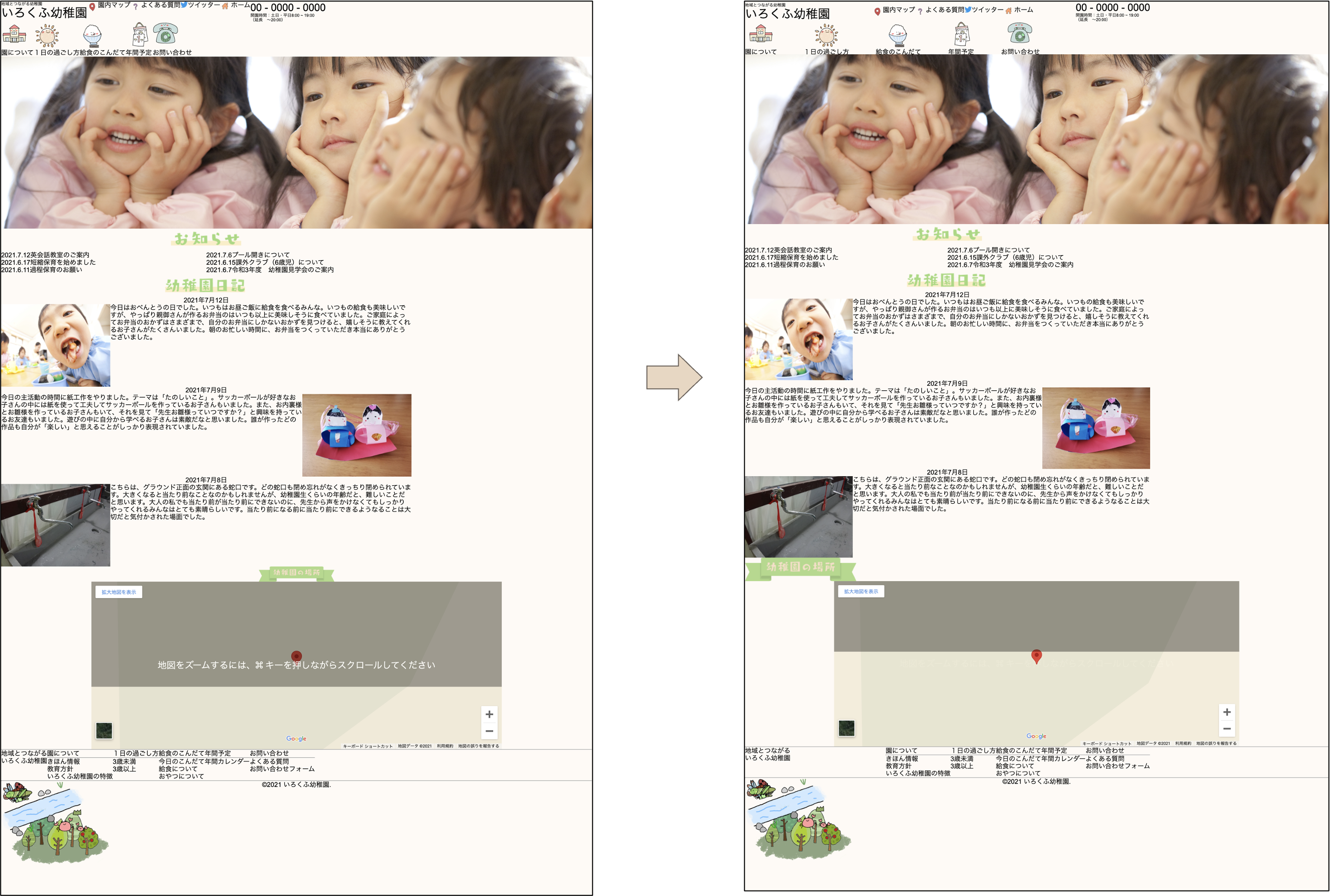
前回すでに要素を横並びにするときに使いましたが、flexはHTMLで要素のレイアウトをする方法の一つです。
親要素と子要素があった時に親要素に「display: flex;」をつけることで、子要素に配置方法を変えられるというものです。
今回もflexboxを使って幅を均等にしたり、上下中央揃えにしてみたりします。
#header_other,
#navigation,
#footer_other {
  justify-content: space-between;
}
#header_other {
  align-items: center;
}
上のスタイルを適用する前と後で比較してみるとこんな感じです。
margin
marginを変えることでもレイアウトすることができます。
例えば、要素の幅を数値で定めて、左右のmarginを「auto」に設定すると左右中央揃えにすることができます。
marginを使って中央揃えにしてみます。
#header_other,
#news, #diary,
#map_heading,
#footer_other {
  margin: 0 auto;
}
#map_content {
  margin-top: 24px;
  margin-bottom: 72px;
}
#news {
  margin-top: 90px;
  margin-bottom: 54px;
}
#map_heading {
    width: 275px;
    height: 58px;
    margin-bottom: 15px;
}
#nav_container {
  margin: 20px auto;
}
これもまた、適用する前後で比べてみます。
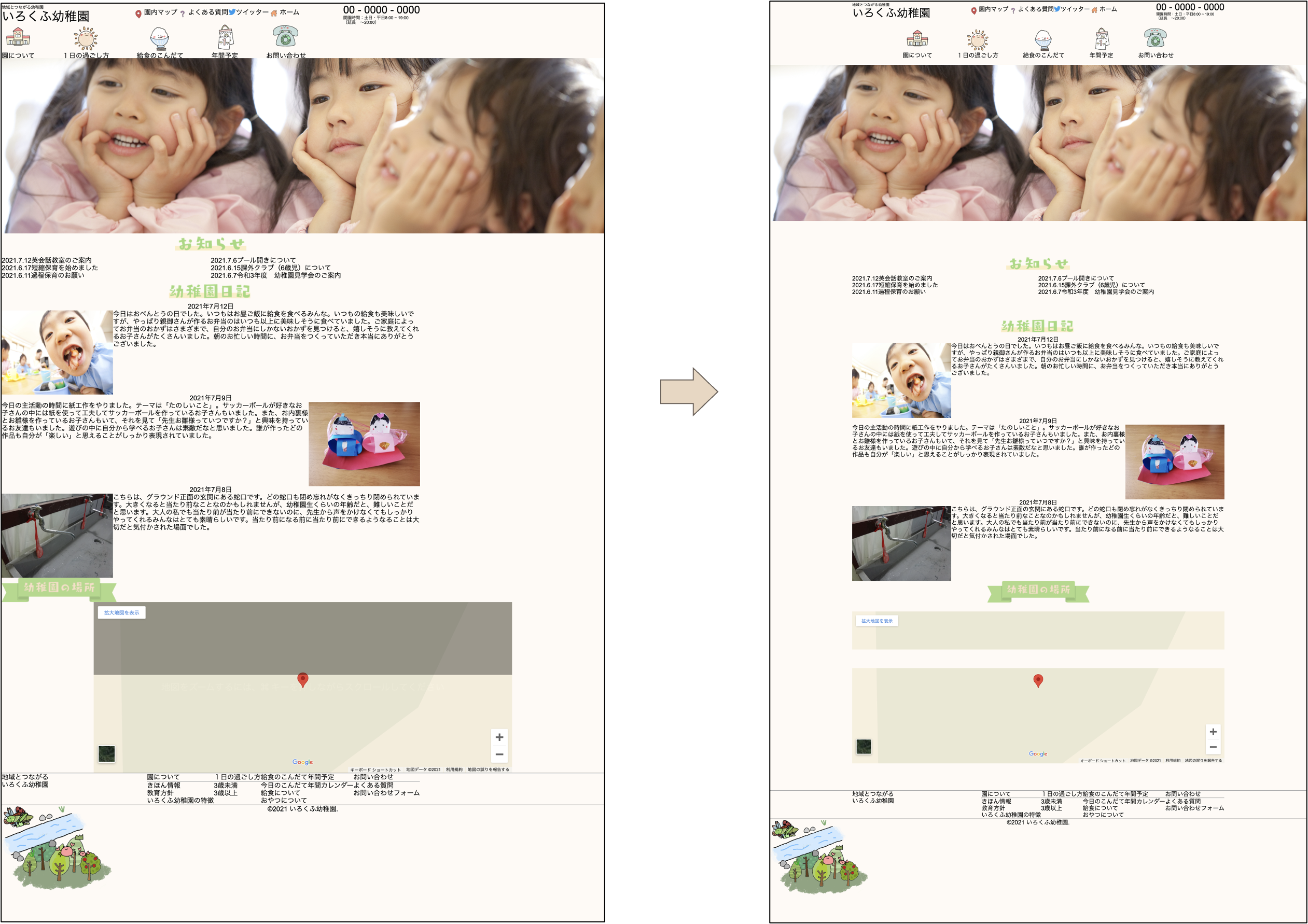
左に偏ってバランスが悪かったページが、一気にバランスよくなりました。
全体像
「top.css」の全部を載せるとこんな感じです。
body {
  background-color: #FFFAF5;
  font-family: "Arial"
}
/* 横並び */
#header_other,
#menu,
#menu li,
#navigation,
#news_content ul,
.diary_body,
#footer_other,
#footer_nav_container {
  display: flex;
}
/* 左右中央揃え */
#news_heading,
#diary_heading,
.diary_date,
#map_content,
#copyright {
  text-align: center;
}
#news_content ul{
  flex-wrap: wrap;
}
#news_content ul li{
  width: 50%;
}
/* JavaScriptで動かすイラスト */
#ladybug_container,
#dragonfly_container,
#omoiyari_container,
#sasaeai_container,
#locust_container {
  position: absolute;
}
/* width: 100%; height: auto; */
#ladybug_container img,
#dragonfly_container img,
#omoiyari_container img,
#sasaeai_container img,
#locust_container img,
#mv_container img {
  width: 100%;
  height: auto;
}
/* コンテンツ幅1000px */
#header_other,
#news, #diary,
#footer_other {
  width: 1000px;
}

#tagline,
#open,
#extra {
  font-size: 9px;
}
#branding {
  font-size: 30px;
}
#menu,
#navigation li,
#news_content,
#diary_date {
  font-size: 16px;
}
#menu li {
  height: 26px;
}
#tel {
  font-size: 25px;
}
#mv_container {
  width: 100vw;
  height: auto;
}
#nav_container {
  width: 728px;
  height: 80px;
}
#navigation {
  width: 100%;
  height: 100%;
}
#diary_body {
  font-size: 15px;
}
#ladybug_container {
  width: 77px;
  height: 61px;
}
#dragonfly_container {
  width: 67px;
  height: 55px;
}
#omoiyari_container {
  width: 279px;
  height: 279px;
}
#sasaeai_container {
  width: 220px;
  height: 140px;
}
#locust_container {
  width: 81px;
  height: 54px;
}

/* 左右中要素寄せ */
#header_other,
#news, #diary,
#map_heading,
#footer_other {
  margin: 0 auto;
}
/* 均等配置 */
#header_other,
#navigation,
#footer_other {
  justify-content: space-between;
}
/* 上下中央寄せ */
#header_other {
  align-items: center;
}
#navigation a {
  display: flex;
  align-items: center;
  flex-direction: column;
}
#map_content {
  margin-top: 24px;
  margin-bottom: 72px;
}
#news {
  margin-top: 90px;
  margin-bottom: 54px;
}
#map_heading {
    width: 275px;
    height: 58px;
    margin-bottom: 15px;
}
#map_heading img {
  width: 100%;
  height: auto;
}
#nav_container {
  margin: 20px auto;
}
コメント