こんにちは、コンスキです。
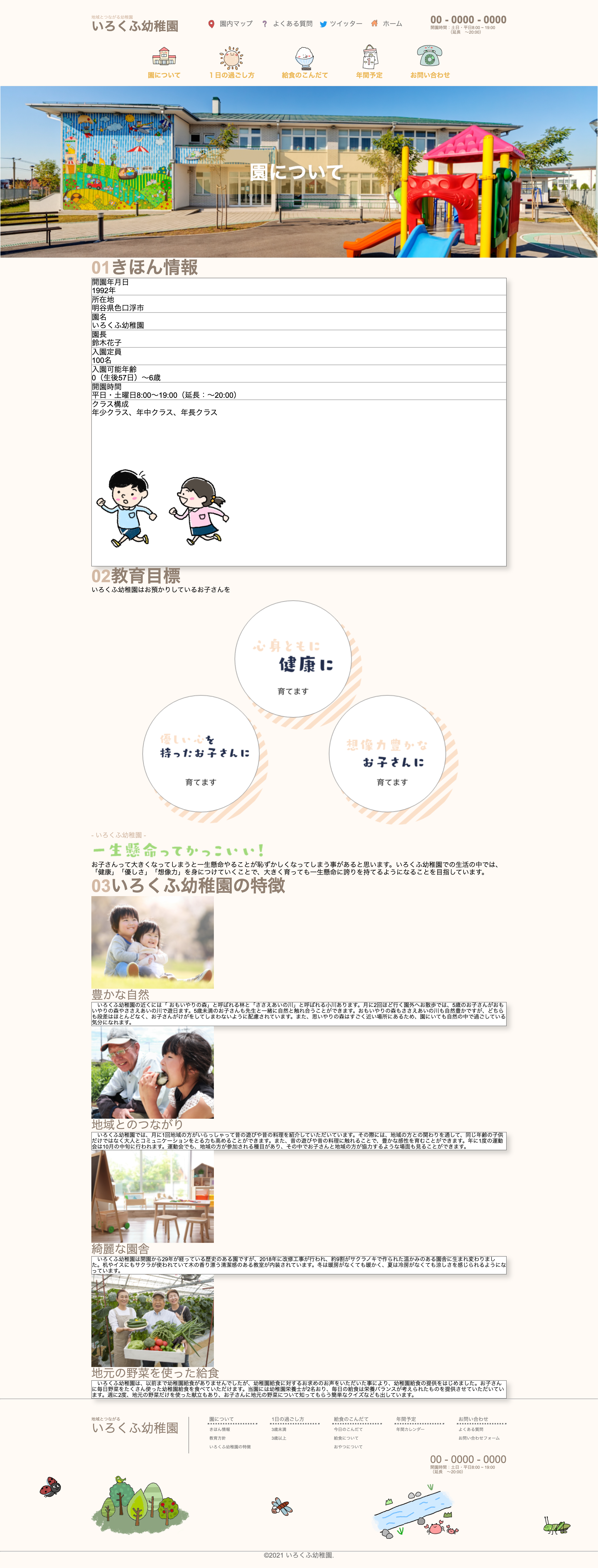
コンテンツ幅
コンテンツ幅を1000pxに設定します。
各セクションの要素には「basic_info」「goal」「feature」というidをつけています。
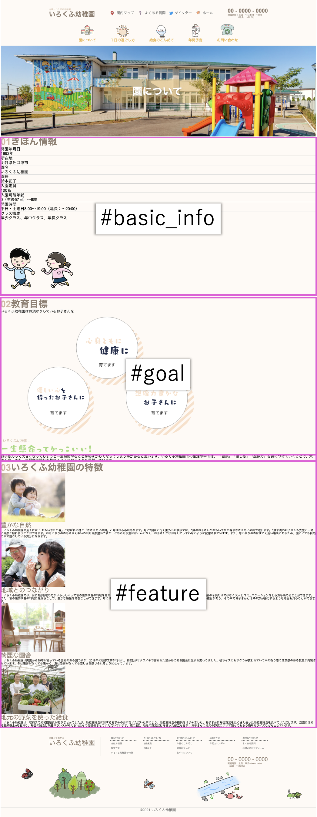
それらの要素に対して「width: 1000px;」を効かせることでコンテンツ幅を1000pxにします。
#basic_info,
#goal,
#feature {
  width: 1000px;
}
コンテンツ幅を設定すると、次のようになります。
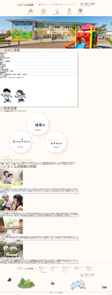
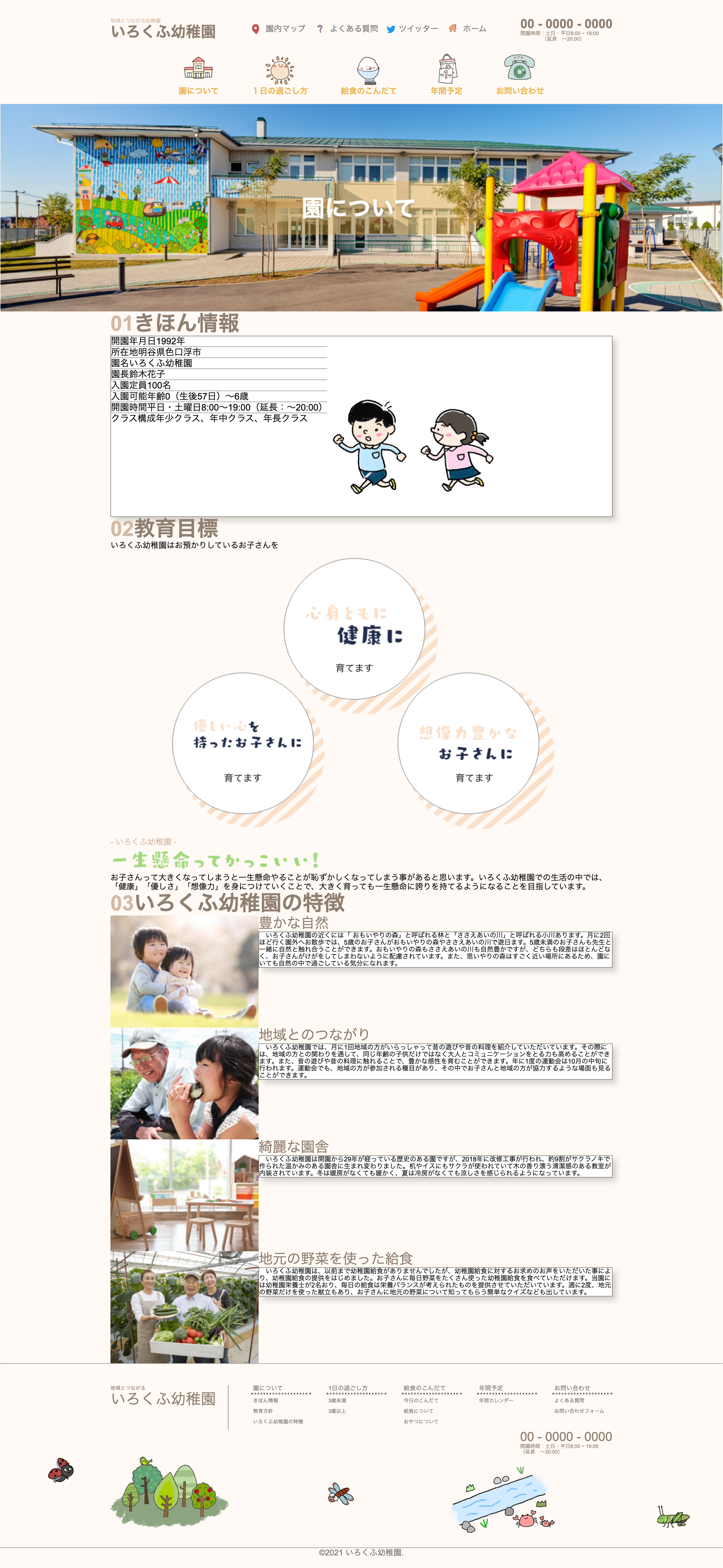
コンテンツを中央に寄せる
コンテンツ幅を設定しただけだと、コンテンツが左に寄った状態になります。
左右のmarginを「auto」にすることで、コンテンツを中央に寄せます。
#basic_info,
#goal,
#feature {
  width: 1000px;
  margin: 0 auto;
}
ブラウザで確認してみます。
ちゃんと中央によりました。
こんな感じで、コンテンツ幅を設定してから、左右のmarginをautoに設定すると、パソコン画面が少し小さかったり、大きかったりしても左右のmarginが設定されて便利です。
横並びにする
「デザインカンプでは、横に並んでいる要素が、現状は縦並びになっている」というところがあります。
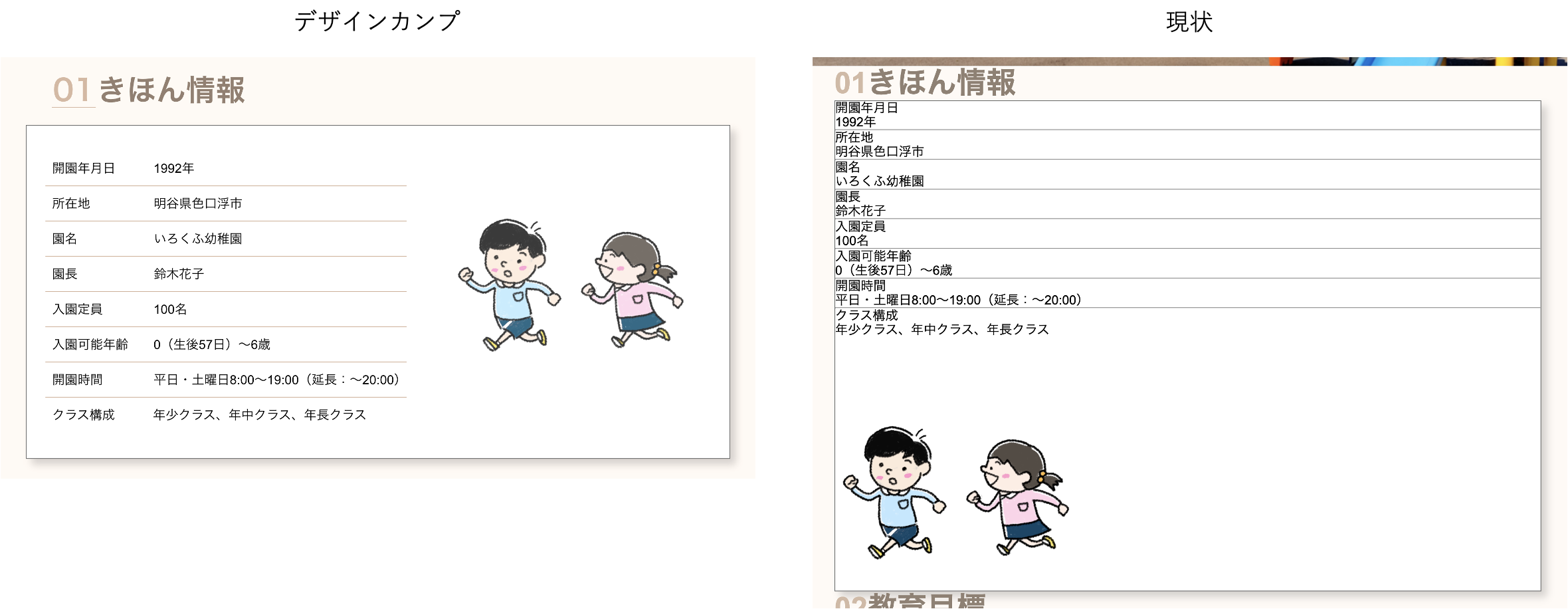
そのような部分をflexboxを使って横並びにしていきます。
#basic_info_content {
  display: flex;
  font-size: 18px;
  color: #000;
}
.basic_info_row {
  display: flex;
}
.feature_row {
  display: flex;
}
すると次のようになります。
微調整
marginやpadding、widthやheightなどの設定を行い、見た目をさらにデザインカンプに近づけます。
#basic_info_heading,
#goal_heading,
#feature_heading {
  font-size: 42px;
  font-weight: bold;
  color: #918072;
}
.heading_num {
  margin-right: 8px;
  color: #D3B9A4;
  border-bottom: 2px solid #D3B9A4;
}
#basic_info_heading {
  margin: 76px auto 36px 24px;
}
#basic_info_content {
  display: flex;
  font-size: 18px;
  color: #000;
}
#kindergarten {
  font-size: 16px;
  color: #D3B9A4;
}
#goal h3 {
  font-size: 48px;
}
#goal p:last-of-type {
  font-size: 16px;
  color: #000;
}
.feature_subheading {
  margin-left: 24px;
  font-size: 28px;
  color: #918072;
  text-decoration: underline;
}
#feature p {
  height: 100%;
  font-size: 13px;
  color: #000;
  background-color: #fff;
  background-image:
  linear-gradient(90deg, rgba(237, 119, 128, 0) 0%, rgba(237, 119, 128, 0) 50%, #fff 0%, #fff 100%), linear-gradient(180deg, rgba(100, 100, 100, 0) 0%, rgba(100, 100, 100, 0) 97.5%, #918072 100%);
  background-size: 8px 100%,100% 2em;
  line-height: 2em;
}
#basic_info_content,
.feature_text_container {
  box-sizing: border-box;
  height: 177px;
  padding: 16px 16px;
  background-color: #fff;
  border: 1px solid #707070;
  box-shadow: 8px 8px 11px 0 rgba(0, 0, 0, 0.16);
  line-height: 26px;
}
#basic_info,
#goal,
#feature {
  width: 1000px;
  margin: 0 auto;
}
#goal {
  margin-top: 36px;
}
#goal_heading {
  margin-left: 36px;
}
#goal_content_container {
  position: relative;
  margin-top: 56px;
}
#promise {
  position: absolute;
  font-size: 20px;
  color: #707070;
}
.basic_info_row {
  display: flex;
  margin-left: 12px;
}

#basic_info_info {
  display: flex;
  flex-direction: column;
  justify-content: space-between;
  margin: 64px 28px;
  width: 513px;
}
#basic_info_info hr {
  height: 1px;
  border: none;
  background-color: #D3B9A4;
}
#basic_info_content {
  height: 474px;
}
#basic_info_content img{
  margin: 0 auto;
}
#start {
  margin-left: 50px;
}
#adress {
  margin-left: 86px;

}
#name {
  margin-left: 104px;
}
#principal {
  margin-left: 104px;
}
#capacity {
  margin-left: 68px;
}
#age_limit {
  margin-left: 32px;
}
#opening {
  margin-left: 64px;
}
#classes {
  margin-left: 50px;
}
#kindergarten {
  text-align: center;
}
#isshokenmei {
  display: block;
  margin: 0 auto;
}
#important {
  margin-top: 12px;
}
#feature {
  margin-top: 60px;
  margin-bottom: 96px;
}
#feature_heading {
  margin-left: 36px;
}
#feature_content_container {
  margin-top: 48px;
}
.feature_row {
  display: flex;
  margin-bottom: 36px;
}
.feature_right {
  display: flex;
  flex-direction: column;
  justify-content: space-between;
  width: 683px;
  margin-left: auto;
}
完成形
最終的にブラウザに表示すると次のようになりました。

コメント